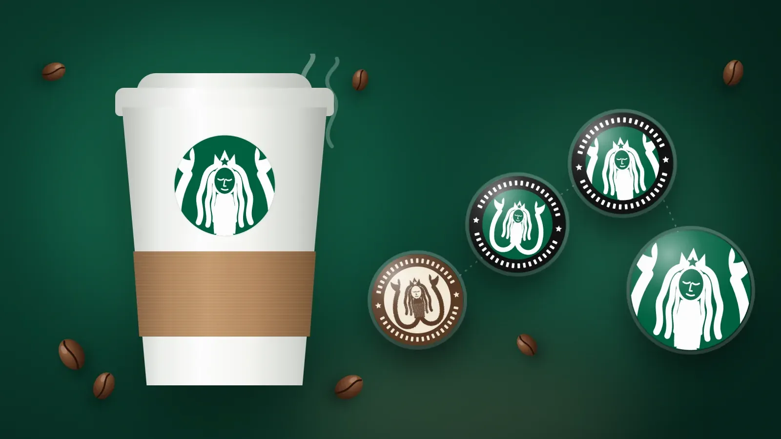
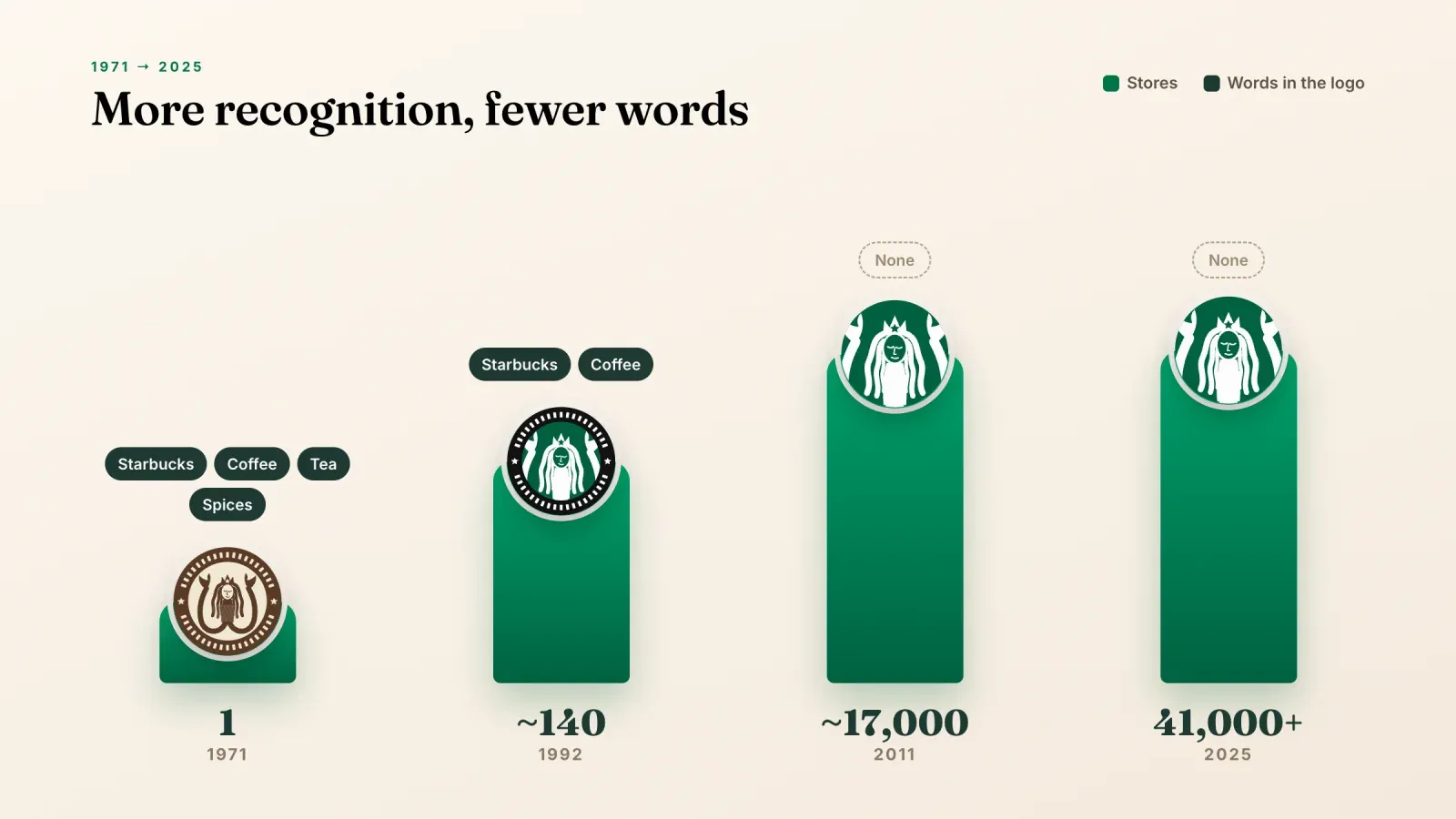
The Starbucks logo is one of the most recognized marks on the planet. A green circle with a crowned, two-tailed siren sits on more than 41,000 stores in 88 markets, on billions of paper cups and on an app that millions of people open every morning. Most of them could draw it from memory, and almost none of them could tell you why a coffee company chose a mythical sea creature in the first place.
This guide tells the full story. You will see how the Starbucks logo changed from a brown woodcut in 1971 to the wordless green siren of 2011, what each element means, the small details designers added that most people never notice, and the controversies along the way. The last part turns the story into practical lessons you can use for your own logo, whether you run a small shop, a creator brand or a one-person business that lives on a link in bio.
The Starbucks logo at a glance
Before the full history, here are the key facts in one place.
- Founded in 1971 in Seattle, near Pike Place Market, by Jerry Baldwin, Zev Siegl and Gordon Bowker.
- Original designer Terry Heckler, a Seattle designer and creative partner of Gordon Bowker.
- Symbol a crowned siren with two tails, adapted from an old Norse woodcut.
- Four main versions 1971, 1987, 1992 and 2011.
- Current logo the siren alone, green on white, with no words and no outer ring, introduced in 2011 for the company's 40th anniversary.
- Signature color Starbucks Green, a deep green the company lists as #006241 in its brand guidelines.
- Who worked on the 2011 version the Starbucks in-house design team together with the branding agency Lippincott.
Where the Starbucks name and the siren came from
The three founders met as students at the University of San Francisco. Baldwin taught English, Siegl taught history and Bowker was a writer. In 1971 they opened a small shop in Seattle that sold whole bean coffee, loose leaf tea and spices. They did not serve drinks by the cup in those early years. The idea was to bring the dark roasted beans that Alfred Peet was selling in Berkeley to Seattle.
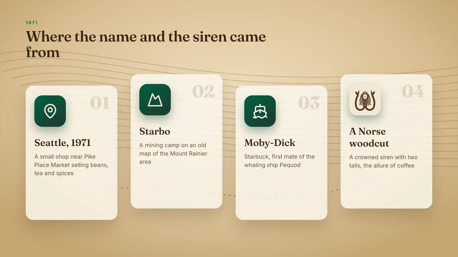
Naming the shop took longer than opening it. Bowker and Terry Heckler, who ran a design agency with him, believed that words starting with "st" sounded strong and memorable. One of the names on the table was "Pequod", the whaling ship in Herman Melville's novel Moby-Dick. It was rejected quickly, since nobody wanted to drink a cup of "Pee-quod". While looking at an old map of the Mount Rainier area, Bowker found a mining camp called Starbo. The word reminded the team of Starbuck, the first mate of the Pequod in the same novel. The name stuck because it sounded both nautical and solid, and it fit a business built on beans that travelled by sea.
With a seafaring name, the founders wanted a seafaring symbol. Heckler went through old marine books and found a woodcut of a twin-tailed siren, usually described as a 16th century Norse illustration. In Greek mythology, sirens lured sailors to the rocks with their songs. Heckler saw the siren as a metaphor for coffee itself, something so seductive that people keep coming back. That idea of allure is still at the heart of the brand today.
The siren also connected the shop to Seattle, a port city where coffee arrived by ship, and to the long history of coffee as a global trade good. A small local store could not afford advertising, so a logo with a story was a smart way to make the brand feel older and richer than it really was.
The Starbucks logo history, version by version
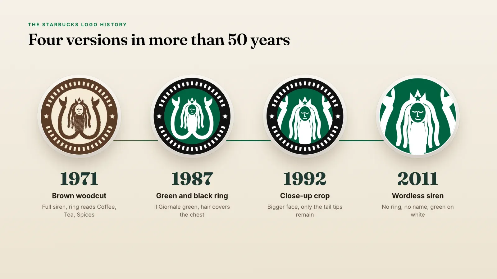
The Starbucks logo has had four main versions in more than 50 years. Each one kept the siren and the circle, and each one removed something. Reading them in order is a lesson in how a brand earns the right to say less.
1971, the brown woodcut siren
The first Starbucks logo was brown, the color of roasted coffee beans and old paper. The siren was shown in full, with her two tails held up on each side, a crown on her head and long flowing hair. She was bare chested, as in the original woodcut, and the drawing kept the rough, carved lines of a print. A ring around her carried the words "Starbucks Coffee Tea Spices", which described exactly what the shop sold.
This version looked handmade and historical on purpose. It matched the store's wooden shelves and burlap sacks, and it suggested that Starbucks belonged to an old tradition of merchants and spice traders. For a single shop in a market, it was perfect. For a chain that would later sit on airport walls and highway signs, it had too many details.
1987, green arrives with Il Giornale
Howard Schultz joined Starbucks in 1982 as director of retail operations and marketing. A trip to Milan in 1983 changed how he saw coffee. He fell in love with Italian espresso bars, where coffee was a daily ritual and a social place, and he tried to convince the founders to serve drinks. They were not interested, so he left and opened his own espresso bar chain, Il Giornale, in 1985.
In 1987 Schultz bought Starbucks from the founders, a deal usually reported at about $3.8 million, and merged it with Il Giornale under the Starbucks name. The logo had to unite both companies. Heckler kept the siren and the circle, and borrowed the green from the Il Giornale logo. Schultz later wrote that green felt fresher and more affirming than brown.
The siren changed too. Her hair now fell over her chest, her lines became cleaner and more graphic, and she looked less like an old print. The outer ring turned black with the words "Starbucks Coffee" separated by two small stars. "Tea" and "Spices" disappeared, a sign that the company now saw itself as a coffee brand first.
1992, the close up crop
Starbucks went public in June 1992 with about 140 stores. The logo was updated the same year with a simple but clever move. The designers zoomed in on the siren. Her face and crown became larger, her navel disappeared from view, and only the tips of her two tails remained visible at the sides of the inner circle.
The crop solved a practical problem. A full body siren is hard to read on a cup from across a room. A close up face is easy to recognize, even small or far away. It also made the siren more personal, closer to a portrait than to a figure from a book. This version stayed in use for almost 20 years, through the period when Starbucks grew from a regional chain into a worldwide brand.
2011, the wordless siren
In January 2011, ahead of the company's 40th anniversary in March, Starbucks revealed a new logo. The black ring and the words "Starbucks Coffee" were gone. The siren was freed from the ring and printed in green on white, alone.
Howard Schultz explained that the company wanted room to sell more than coffee in more places, from grocery store shelves to new product lines, and that a logo with the word "coffee" in it felt limiting. Removing the name was also a sign of confidence. By 2011 the siren was so well known that people recognized the brand without reading anything.
The work was done by the Starbucks in-house team with the agency Lippincott. Many of the changes were too small to see at first glance. The lines were refined, the face was cleaned up, and the designers made one subtle choice that most customers never notice, which you will read about below.
What the Starbucks logo means
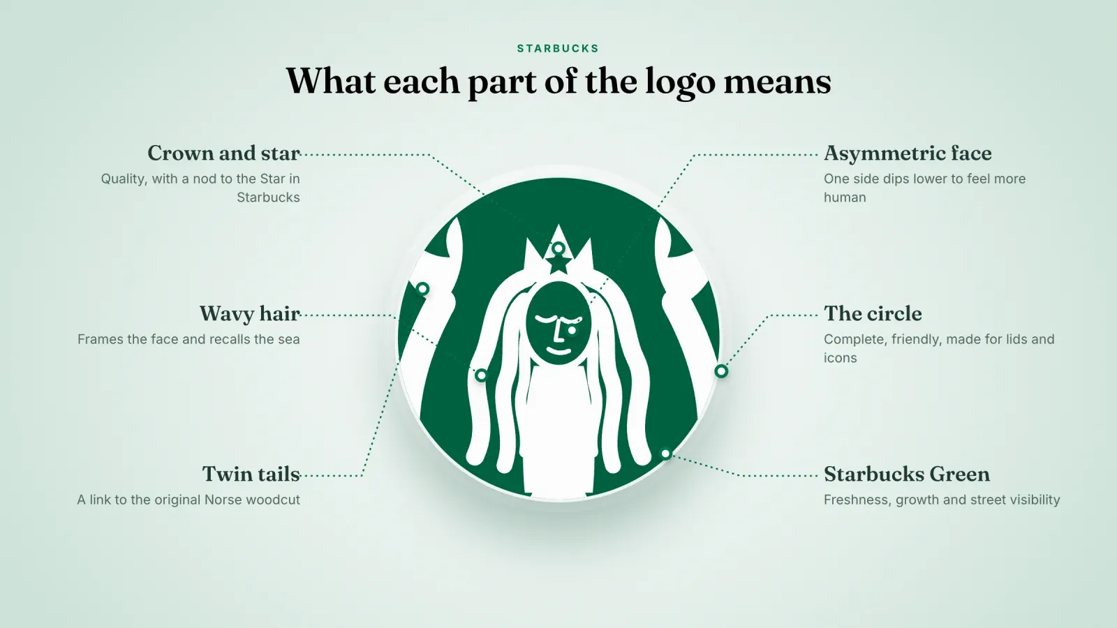
Every element of the logo carries part of the brand's story. Here is how to read it.
The siren. She stands for the seductive power of coffee and for the sea that brought the beans from far away. Starbucks itself calls her the Siren with a capital S and treats her as a character more than a picture.
The two tails. The twin tails come straight from the original woodcut. In heraldry and folklore, a two-tailed mermaid is sometimes linked to the Melusine figure, a symbol of mystery and transformation. For Starbucks, the tails mainly keep the nautical link and give the logo its unusual, symmetrical frame.
The crown and its star. The siren wears a crown with a star at its center. The crown suggests quality and leadership. The star is a quiet nod to the "Star" in Starbucks, and it was also echoed by the two stars on the old outer ring.
The wavy hair. Her hair flows like waves around her face. It frames the portrait, softens the design and hints at the water again.
The circle. A circle feels complete, friendly and protective. It also works perfectly on round objects like cup lids, coasters, app icons and profile pictures.
The green. Green suggests freshness, growth, nature and calm. It also stands out on a busy city street full of red, yellow and blue signs. Starbucks says its green is one of the most recognizable parts of the brand, and it uses it far beyond the logo, from aprons to store signs.
The details most people never notice
Look closely at the current Starbucks logo and you will find a few choices that only designers tend to spot.
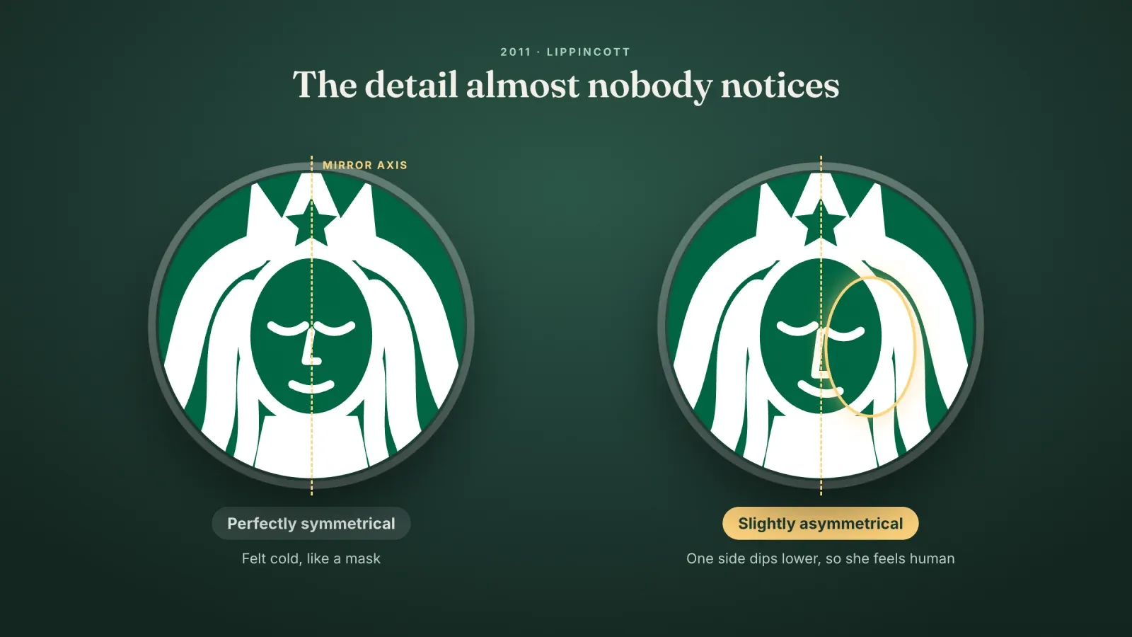
The face is not perfectly symmetrical. When Lippincott refined the siren in 2011, the team first made her face perfectly symmetrical. The result looked cold and artificial, like a mask. So they added a small imperfection. One side of her face has a slightly longer shadow and dips a little lower than the other. The difference is tiny, but it makes her look more human and approachable. It is the visual equivalent of a warm smile instead of a posed one.
The star sits in the exact center of the crown. It is placed on the vertical axis of the whole logo, which helps the eye find the middle of the circle instantly.
The tails are still there. Even after the 1992 crop, the curling ends of the two tails remain at the sides. They keep a thread back to the 1971 original, even though most people do not realize they are looking at tails.
There is a lot of empty space. The 2011 version removed the ring and gave the siren room to breathe. That white space is what makes the logo feel lighter and more modern than the 1992 badge.
The original never disappeared. The first Starbucks store at Pike Place Market still uses the brown 1971 style logo. Visitors take photos of it as part of the story, and Starbucks sells merchandise with the vintage mark there.
Why the Starbucks logo works
Many brands have a pretty logo. Few have one that people feel attached to. The Starbucks logo works because it combines several strengths that support each other.
It has a story. The siren is a character with a myth behind her, which gives people something to talk about. A logo with a story is easier to remember than an abstract shape.
It evolved without breaking. Each version kept the siren, the circle and the general composition. Customers never felt that the brand had disappeared, even when the colors or the words changed.
It was simplified at the right moment. Starbucks waited until the siren was famous before removing the name. Doing it too early would have left people confused. Doing it in 2011 felt like a natural next step.
It owns a color. Starbucks Green is so consistent across stores, cups and the app that the color alone suggests the brand. Owning a color is one of the strongest assets a business can build.
It works at every size. The current siren reads clearly on a 30 meter wall, on a cup and on a small app icon. The 1971 version would have turned into a brown blur at app icon size.
It is consistent. The logo appears in the same way across thousands of stores and products. That repetition, year after year, is what builds recognition more than any single design decision.
The controversies around the Starbucks logo
The siren has not always been popular with everyone. Three moments are worth knowing.
The brown logo returns, twice. In 2006, for its 35th anniversary, Starbucks brought back the original brown siren on some cups. It did it again in 2008 to launch Pike Place Roast. Some groups complained that the bare chested siren was inappropriate on a coffee cup, and a few called for boycotts. The vintage cups were temporary, and the episode mostly generated press.
The 2011 redesign scared fans. When Starbucks announced that it would drop its name from the logo, many customers and commentators reacted badly. The timing was sensitive. A few months earlier, in October 2010, Gap had launched a new logo and reversed it within about a week after a public outcry. People expected a similar backlash. Starbucks held its course, explained the reasons, and the wordless siren was quickly accepted.
Parodies and lawsuits. A famous logo attracts imitations. Starbucks has defended its siren and its name many times against businesses with similar marks, and the logo has inspired countless parodies. Both are signs of how deeply it has entered popular culture.
Starbucks green and the wider identity system
A logo is only one part of a brand. Starbucks built a complete identity system around the siren, and that system explains why the logo feels so consistent everywhere.
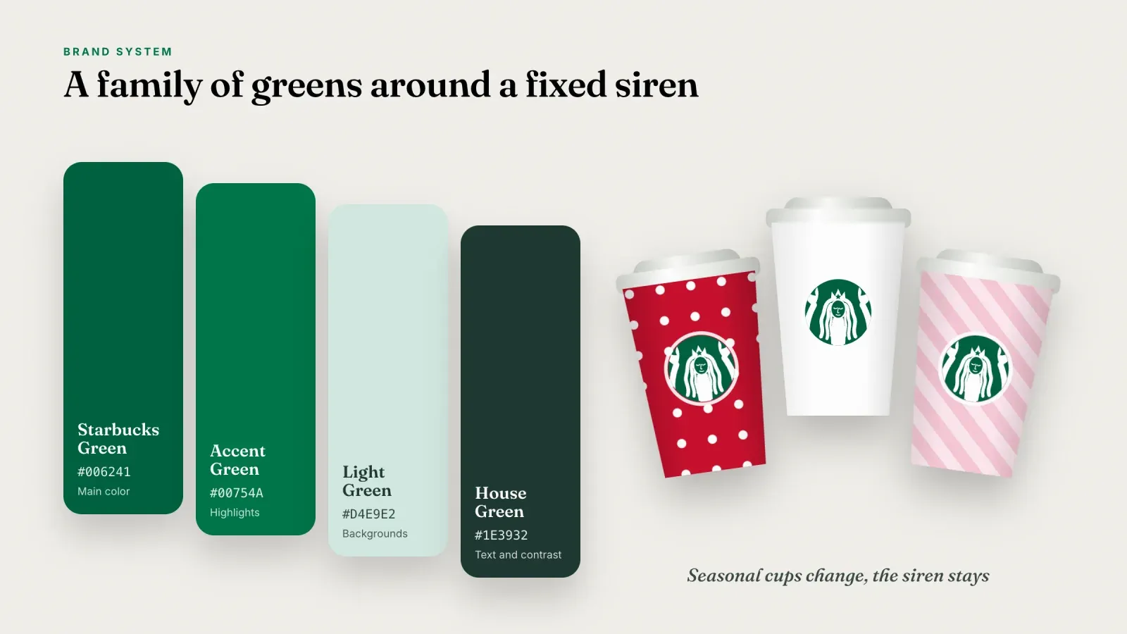
A family of greens. The Starbucks brand guidelines describe several greens. Starbucks Green (#006241) is the main color. Accent Green (#00754A) is a slightly brighter green for highlights. Light Green (#D4E9E2) is a soft tint for backgrounds, and House Green (#1E3932) is a very dark green for text and contrast. Using a small family of related shades lets designers create variety without leaving the brand.
Custom typefaces. Starbucks uses its own type family, with Sodo Sans for most text, Lander as a warm serif and Pike for bold display headlines. Owning typefaces gives the same voice to menus, the app and packaging.
Seasonal freedom around a fixed center. The holiday cups, the reserve stores and limited editions change colors, patterns and illustrations every year. The siren stays the same. That mix of a fixed core and a flexible surface is what lets the brand stay fresh without losing its identity.
A separate mark for premium lines. Starbucks Reserve, its premium coffee line, uses a different symbol, a star with the letter R. Keeping it separate protects the main siren while giving the premium range its own personality.
Lessons for your own logo as a creator or small brand
You do not need a global agency to apply what Starbucks learned. Here are the lessons that matter most for a small business, a creator or a solo entrepreneur.
1. Start with a story. The siren works because it means something. Look for a symbol linked to your name, your origin, your product or your values. A simple story behind your mark gives people a reason to remember it and to talk about it. If you are building a personal brand, your initials, a signature object or a recurring visual from your content can play the same role.
2. Design for the smallest use first. Today most people will meet your logo as a tiny circle, in a profile picture, a browser tab or a notification. If your mark is not readable at that size, it is too complex. Starbucks needed 40 years to reach a simple siren. You can start there.
3. Pick one main color and use it everywhere. Choose one strong color for your brand and repeat it on your profile, your store page, your packaging and your posts. Consistency turns a color into an asset.
4. Keep your name next to the symbol at first. Starbucks dropped its name only when the siren was famous. If you are just starting, use a symbol and a wordmark together, so people learn to connect the two.
5. Evolve slowly and keep the core. If you redesign, keep the elements people already recognize, such as the shape, the color or the main symbol. Change one thing at a time, and explain the change to your audience when it matters.
6. Add a human touch. The asymmetric face shows that perfect is not always better. A slightly hand drawn line, a warm color or a playful detail can make a logo feel friendly instead of corporate.
7. Build a small system around it. Define your colors, one or two fonts and a few rules on how to place your logo. With a simple system, every post, product and page will look like it comes from the same brand. For brands that do not show a face, this system matters even more, as we explain in our definition of a faceless brand.
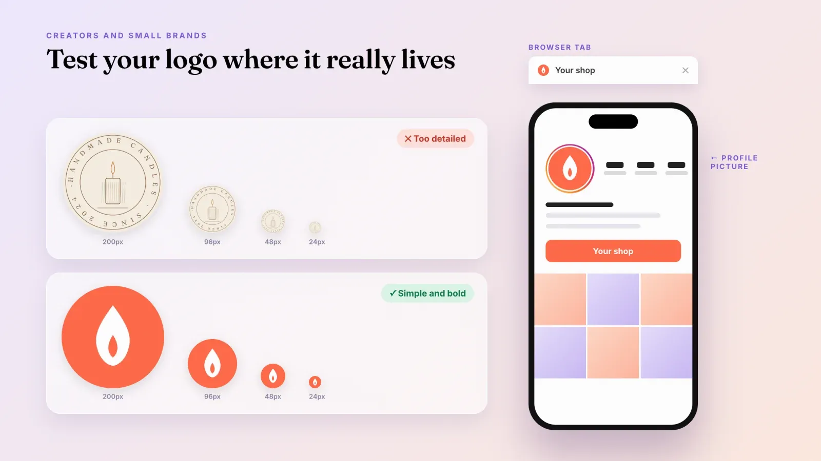
How to design a logo that works in a profile picture
For most creators and online sellers, the logo lives first in a circle on Instagram, TikTok or YouTube, and on the page behind the link in bio. Here is a simple process.
- Write down what your brand stands for in three words. These words will guide your choices of symbol, shape and color.
- Sketch ideas inside a circle. Profile pictures are cropped to a circle on most platforms, so start there instead of in a rectangle.
- Test at small sizes. Shrink your logo to 32 pixels, the size of a browser tab icon, and look at it from a distance. If you cannot recognize it, remove details.
- Check it in one color. A good logo still works in black on white or white on a dark color. This will help you on stamps, stickers, invoices and dark mode screens.
- Choose a contrasting background. A logo on a solid colored background stands out better in a feed than a logo on white.
- Export clean files. Keep a square PNG at high resolution for profile pictures, an SVG for the web and a small version for favicons. Instagram displays profile pictures at about 110 pixels on mobile, but uploading at least 320 by 320 pixels keeps them sharp.
- Use the same logo everywhere. The same image on all your social profiles, your storefront and your emails helps people recognize you across platforms, exactly like the siren on cups, signs and the app.
Common mistakes when you design a logo
Copying a famous logo too closely. It is tempting to borrow the look of a brand you admire. Similar shapes, colors or characters can cause legal trouble and make you look like an imitation. Take inspiration from the principles, never from the drawing itself.
Too many details. Fine lines, small text and shadows disappear at small sizes. The 1971 siren was beautiful in print, but it would not survive as an app icon.
Too many colors. Every extra color makes the logo harder to reproduce and less memorable. One or two colors are enough for most small brands.
Changing your logo too often. Each change resets part of the recognition you built. Plan your logo carefully and keep it for years, with small updates when needed.
Following trends only. Trendy fonts and effects age quickly. Starbucks kept a timeless symbol and updated the details around it.
Frequently asked questions
What is the Starbucks logo? The Starbucks logo is a green and white circular mark showing a crowned siren with two tails. Since 2011 it appears without the company name or outer ring.
Who designed the Starbucks logo? Terry Heckler, a Seattle designer, created the original 1971 logo and the 1987 redesign. The 2011 version was developed by the Starbucks in-house design team with the branding agency Lippincott.
What was the original Starbucks logo? The original 1971 logo was brown and showed a full siren with two tails and a crown, inspired by an old Norse woodcut. A ring around her read "Starbucks Coffee Tea Spices".
Is the Starbucks logo a mermaid or a siren? Starbucks calls her a siren. In Greek mythology, sirens lured sailors with their song, which is how the founders saw coffee. Visually she looks like a two-tailed mermaid, which is why many people call her a mermaid.
Why is the Starbucks logo green? The green came from Il Giornale, the espresso bar chain Howard Schultz founded before he bought Starbucks in 1987. Green suggests freshness and growth, and it stands out on busy streets.
Why did Starbucks remove its name from the logo? In 2011 Starbucks wanted the freedom to sell more than coffee and to expand into new products and places. The siren was well known enough to represent the brand without words.
Is the Starbucks siren face symmetrical? No. During the 2011 redesign, the designers made one side of her face slightly different from the other so she would look more human and friendly.
How many times has the Starbucks logo changed? The logo has had four main versions, in 1971, 1987, 1992 and 2011, plus temporary returns of the vintage brown logo for special occasions.
Give your brand a home that matches your logo
A strong logo deserves a page that looks just as consistent. Create your free Roctify page to bring your logo, your colors and your products together in one storefront behind your link in bio, with built-in checkout and 0% transaction fees on every plan. If you are still building your image, read our guide on the benefits of a personal brand to see how a clear identity helps you sell.