Your link in bio page might have the right links, a nice photo, and a brand color that matches your feed. And still, most visitors leave without tapping anything. Very often the problem is not the links themselves. It is the words written on them.
A link label is the only information a visitor has before deciding to tap. They arrived from a video, a story, or a comment, they are curious but busy, and they give your page a few seconds at most. In that time they read a handful of buttons and ask themselves one question: "Is any of this for me?" If your labels say "Shop", "Blog", "YouTube" and "Click here", the honest answer is "maybe, I am not sure", and unsure visitors do not tap.
The good news is that renaming links is the fastest improvement you can make to a link in bio page. It costs nothing, it takes twenty minutes, and it often changes click rates more than a full redesign. This guide shows you exactly how to name your links, with ten rules, more than sixty labels you can copy, the labels to retire today, a simple rewrite method, and a way to measure whether your new labels work.
Why link labels matter more than you think
Think about how people actually use a link in bio page. They open it on a phone, usually with one thumb, often while doing something else. They do not read every word. They scan the buttons from top to bottom, and their eyes stop on the first label that clearly matches what they came for.
That means each label is competing for a fraction of a second of attention. A vague label loses that competition even when the page behind it is excellent. A clear label wins it even when the design is plain.
Labels also shape expectations. When a visitor taps "Get the free 7-day meal plan", they know what they will receive, so they arrive ready to enter their email. When they tap "Freebie", they have no idea, so they arrive suspicious and leave quickly. Better labels do not only bring more clicks. They bring better clicks, from people who are ready for what they find.
Finally, labels are your chance to sell without being pushy. A button that says "Book a 30-minute strategy call" quietly tells visitors that you offer calls, how long they last, and what they are for. Over time, that clarity builds trust in everything you share.
The three questions every label must answer
Before the rules, keep one simple framework in mind. Every good link label answers three questions at a glance:
Where does it go? The visitor should know what they will find after tapping: a product, a video, a booking form, a free guide.
Why should I care? The label should hint at the benefit, the reason this link is worth their time right now.
What will it cost me? Money, time, an email address, an account. When the cost is clear, the right people tap and the wrong people do not waste a click.
You will rarely fit all three into a short button, and that is fine. The description line under the label, or a small icon, can carry part of the answer. But if a label answers none of these questions, it needs a rewrite.
1. Start with a verb
The strongest labels begin with an action. A verb tells visitors what happens when they tap, and it turns a passive list into a set of clear choices.
Compare "Newsletter" with "Join my weekly newsletter", or "Recipes" with "Cook this week's easy dinners". The second version of each is longer, but it is instantly understandable and it feels like an invitation.
Good verbs are specific: shop, book, watch, listen, read, join, download, get, order, reserve, apply, try, learn, cook, start. Weak verbs are vague: explore, discover, check out, see more. They sound active but they do not say what the visitor will actually do.
Try it: take your three most important links and add a precise verb at the start of each label. If you cannot find the right verb, it usually means the link itself has no clear purpose.
2. Name the destination, not the format
"Blog", "Website", "Podcast" and "YouTube" describe formats. They tell visitors what kind of container is behind the button, not what is inside. A visitor who does not already know your blog has no reason to tap "Blog".
Name what they will find instead. "Read my guide to saving for a first home" is more useful than "Blog". "Watch the full kitchen makeover" beats "YouTube". "Listen to the episode with a Michelin chef" beats "Podcast".
This matters even more when you update your page for a campaign. If your latest video points to a specific product, the label should name that product, not "Shop". Visitors should recognize exactly what they saw in the content that brought them there.
3. Promise the payoff
People do not want to sign up, subscribe, or register. They want what comes after. So lead with the result, not the mechanism.
"Sign up" is the mechanism. "Get my best money tips every Sunday" is the payoff. "Register" is the mechanism. "Save your seat for the live workshop" is the payoff. "Download" is the mechanism. "Get the free wedding planning checklist" is the payoff.
A good test: read the label and ask "so what?" If the answer is not in the label, move it there. The payoff is the reason to tap, so it deserves the most visible spot.
4. Add a number when it helps
Numbers catch the eye in a list of words, and they make promises concrete. "Join 12,000 readers" signals an active community. "Get 5 free Lightroom presets" tells people exactly what they receive. "Book a 20-minute call" sets clear expectations about time.
Useful numbers include audience size, number of items, duration, results, and discounts. Use them honestly. An inflated number damages trust the moment someone notices, and a small real number, like "Join 800 plant lovers", can feel more personal than a big one.
Do not put numbers everywhere. One or two numbered labels on a page stand out. Seven of them turn into noise.
5. Show the price or the cost
It feels risky to put a price on a button, but transparency usually helps. Visitors who see "Shop the linen collection, from $49" know what to expect. Those who can afford it tap with intent, and those who cannot do not waste their time or leave frustrated.
The same logic applies to other costs. "Free, no email needed" removes friction for a resource. "Takes 2 minutes" encourages people to fill in a form. "Members only" tells casual visitors that this link is not for them, which protects the experience of your paying community.
If the price does not fit the label, put it in the description line. The goal is simple: nobody should feel tricked after tapping.
6. Keep labels between two and six words
On a phone, a link in bio button has room for roughly 25 to 35 characters per line. Long labels wrap onto two or three lines, which makes the page harder to scan and pushes your other links out of view.
Aim for two to six words. "Book a free discovery call" works. "Click here to book a free discovery call with me to talk about your project" does not.
Short does not mean vague. "Shop" is short and weak. "Shop the summer sale" is short and strong. Cut filler words like "here", "my", "now" and "please" first, and keep the words that carry meaning.
Try it: open your page on your own phone and look at every label. Any label that wraps onto three lines needs to be shortened.
7. Use the description line for the details
Many link in bio tools, including Roctify, let you add a short description or subtitle under each link title. This second line is perfect for the details that would make the main label too long: dates, locations, prices, audience, or a small reassurance.
For example, the title "Save your seat for the workshop" can carry the description "Thursday 7pm, online, free". The title "Order the new cookbook" can carry "Signed copies ship this week". The title "Book a coaching session" can carry "For beginners, 45 minutes".
Keep the description to one short line. Its job is to answer the last question a visitor has before tapping, not to repeat the title. If a link does not need a description, leave it empty. White space helps the important details stand out.
8. Use emojis with intent
Emojis can make a list of links easier to scan, give your page personality, and help visitors spot the right button faster. They can also make a page look cluttered and childish when overused.
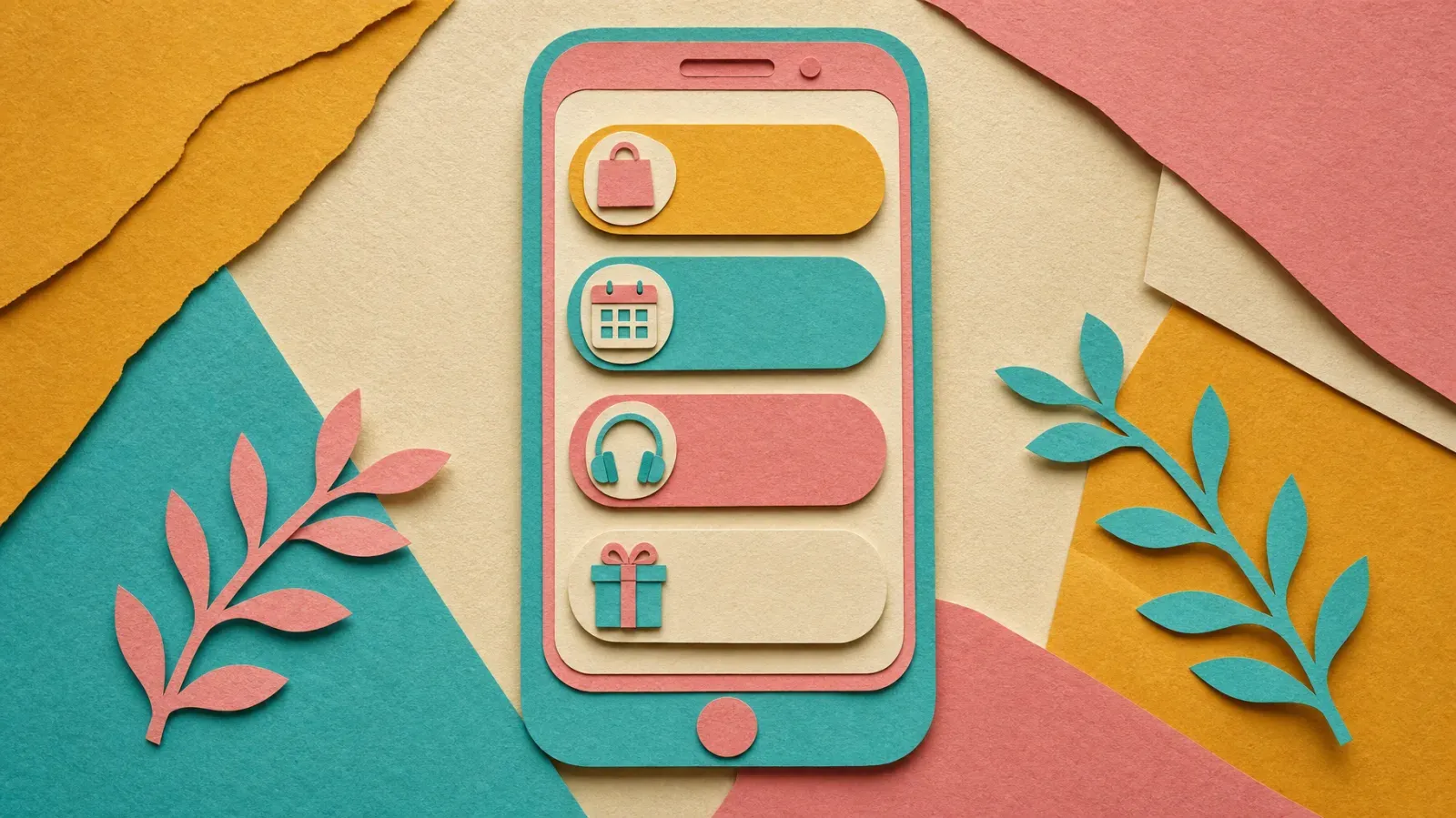
Use emojis as signposts, not decoration. One relevant emoji at the start of a label works well: a shopping bag for your shop, a calendar for bookings, a headphone for the podcast, a gift for a freebie. Avoid stacking several emojis, using emojis that do not match the link, or replacing words with emojis entirely.
Also remember accessibility. Screen readers read emojis out loud, so "🔥🔥🔥 New drop 🔥🔥🔥" becomes a long and confusing sentence. One emoji per label is plenty.
9. Speak your audience's language
The best labels sound like the people who read them. A skincare brand speaking to teenagers will not name links the same way as a financial advisor speaking to retirees, and it should not.
Listen to how your audience describes what they want. Read your comments and messages. If followers keep asking "where did you get that dress?", a link called "Shop the dress from today's video" answers them in their own words. If clients ask "how much does it cost to work with you?", a link called "See coaching packages and prices" is exactly what they are looking for.
This also applies to languages. If a large part of your audience speaks another language, consider writing key labels in that language, or creating a separate page for them.
10. Order your links by priority
Labels do not work alone. Their position on the page changes how often they get tapped. Most visitors look at the first two or three buttons and decide from there, so your most important link should always be at the top, with the clearest label.
Decide what matters most right now. It might be a product launch, a new video, a limited offer, or your main service. Put that link first, give it the strongest label, and consider highlighting it with a different style or a short animation if your tool allows it.
Then remove or group the rest. A page with fifteen links forces visitors to think. A page with five well-named links makes the choice easy. Social profiles, in particular, work better as a row of small icons than as full-width buttons that compete with your main offer.
60+ link label ideas you can copy
Use these as starting points and adapt them to your own products, audience, and voice.
For shops and products
- Shop the new collection
- Shop the look from today's video
- Get the bestseller, from $29
- Order the limited edition
- Browse gifts under $50
- Shop the summer sale, up to 40% off
- Pre-order before it sells out
- Find your perfect size
For bookings and services
- Book a free 15-minute call
- Book your next appointment
- Reserve a table for tonight
- Check my availability
- Get a quote in 24 hours
- Apply for 1:1 coaching
- See packages and prices
- Book a portrait session
For content
- Watch the full video
- Watch the latest episode
- Listen to the podcast on Spotify
- Read the full story
- Read my most popular guide
- Get the recipe from today's reel
- See the before and after
- Start with my beginner series
For newsletters and communities
- Join 10,000 weekly readers
- Get my tips every Sunday
- Join the free community
- Get early access to new drops
- Join the waitlist
- Become a member
- Get exclusive discounts by email
- Join the private group
For free resources and lead magnets
- Get the free checklist
- Download the free template
- Get 5 free presets
- Take the 2-minute quiz
- Get the free meal plan
- Grab the free starter kit
- Try the free lesson
- Get the free budget spreadsheet
For events and launches
- Save your seat for the live
- Get tickets for the tour
- RSVP for the launch party
- Join the free workshop
- Watch the replay
- Get notified at launch
- See all upcoming dates
For support and donations
- Support my work on Patreon
- Buy me a coffee
- Tip the creator
- Sponsor the next video
- Donate to the fundraiser
For collaboration and contact
- Work with me
- Send a brand partnership request
- Download my media kit
- Ask me a question
- Email the team
- Hire me for your event
Labels to retire today
Some labels appear on thousands of link in bio pages and quietly cost clicks every day. If you use any of these, rewrite them first.
"Click here" and "Tap here." They describe the action but not the destination. Every button is clickable, so the words add nothing.
"Link", "Website" and "Visit my site". Visitors are already on one of your pages. Tell them what your website offers instead.
"Learn more" and "More info". More about what? These labels ask for a click without giving a reason.
"Shop" or "My shop" alone. Better than nothing, but a specific product, collection, or offer always performs better.
Platform names as full-width buttons. "Instagram", "TikTok" and "YouTube" buttons take space from your real offers. Move them to a row of icons, or name the specific content: "Watch my tutorials on YouTube".
Time-sensitive labels you forgot to update. "New video!", "Out now" and "Last chance" become confusing when they stay on your page for months. Either update them regularly or use evergreen wording.
Inside jokes and vague creative names. "The vault", "Goodies" or "The good stuff" can be fun for loyal fans, but new visitors cannot decode them. Add a clear description if you keep them.
The 20-minute link rewrite
You do not need a full redesign to improve your page. Block twenty minutes and follow these steps.
Step 1: define your main goal. Write down the one action you most want visitors to take this month: buy a product, book a call, join your newsletter, or watch a video.
Step 2: list your current labels. Copy every label into a note, without the design. Seeing them as plain text makes weak labels obvious.
Step 3: test each label with the three questions. Where does it go? Why should I care? What will it cost me? Mark every label that answers none of them.
Step 4: rewrite the top three first. Your first three buttons get most of the taps. Give them a verb, a clear destination, and a payoff.
Step 5: add description lines. Move dates, prices, durations, and audience details into the subtitle so the main labels stay short.
Step 6: read the page out loud. If a label sounds strange when spoken, it will feel strange when read. Natural phrasing wins.
Step 7: check it on a phone. Open your page on a real phone, look for labels that wrap onto three lines, and make sure the most important link is visible without scrolling.
How to know if your new labels work
Renaming links is only useful if it changes behavior, so measure the result.
Look at the click share, not only total clicks. Your total clicks depend on how much traffic your content brings that week. The better signal is the percentage of visitors who tap your priority link. If 12% of visitors tapped "Shop" and 19% tap "Shop the linen collection, from $49", the new label works.
Change one label at a time. If you rewrite everything at once and clicks go up, you will not know which change made the difference. Change your most important label first, wait a week or two, then move to the next.
Follow the visitor after the click. More clicks are not always better. If a new label brings more clicks but fewer sales or sign-ups, it might be attracting the wrong people or promising something the page does not deliver. Check conversions, not just taps.
Keep a simple log. Write down the date, the old label, the new label, and the click share before and after. After a few months, you will know exactly which words work for your audience.
A link in bio tool with per-link analytics makes this easy. Roctify shows clicks for every link on your page, so you can compare labels week after week without spreadsheets or guesswork.
Link label examples by creator type
Here is how the rules come together for different kinds of pages.
Fitness coach. "Start the free 7-day program", "Book a 1:1 coaching call", "Shop my resistance bands, from $25", "Watch today's full workout", "Join 5,000 members in the challenge".
Online store. "Shop the new arrivals", "Get 15% off your first order", "Find your size in 30 seconds", "Track your order", "Read 2,000 customer reviews".
Musician. "Listen to the new single", "Get tickets for the Paris show", "Watch the official video", "Pre-save the album", "Shop tour merch".
Restaurant or café. "Reserve a table", "See today's menu", "Order for delivery", "Book the private room", "Get directions".
Photographer. "Book a portrait session", "See wedding packages and prices", "View my portfolio", "Get the free posing guide", "Check available dates".
Podcaster. "Listen to the latest episode", "Watch the video version", "Become a supporter", "Suggest a guest", "Get the show notes by email".
Freelancer or consultant. "Book a free discovery call", "See my services and rates", "Read client case studies", "Download my portfolio", "Get the free project checklist".
Common mistakes to avoid
Writing labels for yourself. Internal names like "Project X" or "Q3 launch" mean something to you and nothing to visitors.
Copying labels from bigger creators. What works for an account with a million followers and a famous product might not work for yours. Use their ideas as inspiration, then adapt them to your audience.
Promising more than the page delivers. A label that says "Free course" should lead to a free course, not a sales page with a small free preview. Broken promises hurt trust quickly.
Forgetting to update seasonal links. A "Black Friday sale" button in March tells visitors your page is abandoned. Set a reminder to review your labels every month.
Using the same label twice. Two buttons called "Shop" confuse visitors. If you have two shops or two offers, name the difference.
Frequently asked questions
How long should a link in bio label be? Two to six words is ideal. On most phones, that fits on one or two lines. Put extra details in the description line under the label.
Should I use capital letters? Sentence case, like "Shop the new collection", is easier to read than all caps and feels friendlier. Use capitals only for short words you want to emphasize, and sparingly.
Are emojis good or bad for link labels? Good when they help visitors scan, bad when they replace words or pile up. One relevant emoji at the start of a label is a safe choice.
How many links should my page have? Most pages work best with three to seven main links. Put your social profiles in an icon row so they do not compete with your offers.
How often should I update my labels? Review them at least once a month, and every time you publish content that points to a specific product, video, or offer.
Can better labels really increase sales? Yes. Clear labels bring more taps from the right people and set the right expectations, which usually improves conversions on the page behind the link.
Name your links, then measure what works
The words on your buttons decide whether visitors keep exploring or leave. Start with a verb, name the destination, promise the payoff, stay short, and move the details to the description line. Then measure the click share of your priority link and keep improving one label at a time.
Roctify makes this easy. Build a link in bio page with titles and descriptions for every link, highlight your most important offer, sell products and bookings directly from the page, and see clicks for each link in your analytics, with 0% transaction fees on every plan. Create your free Roctify page and give every link a name worth tapping.