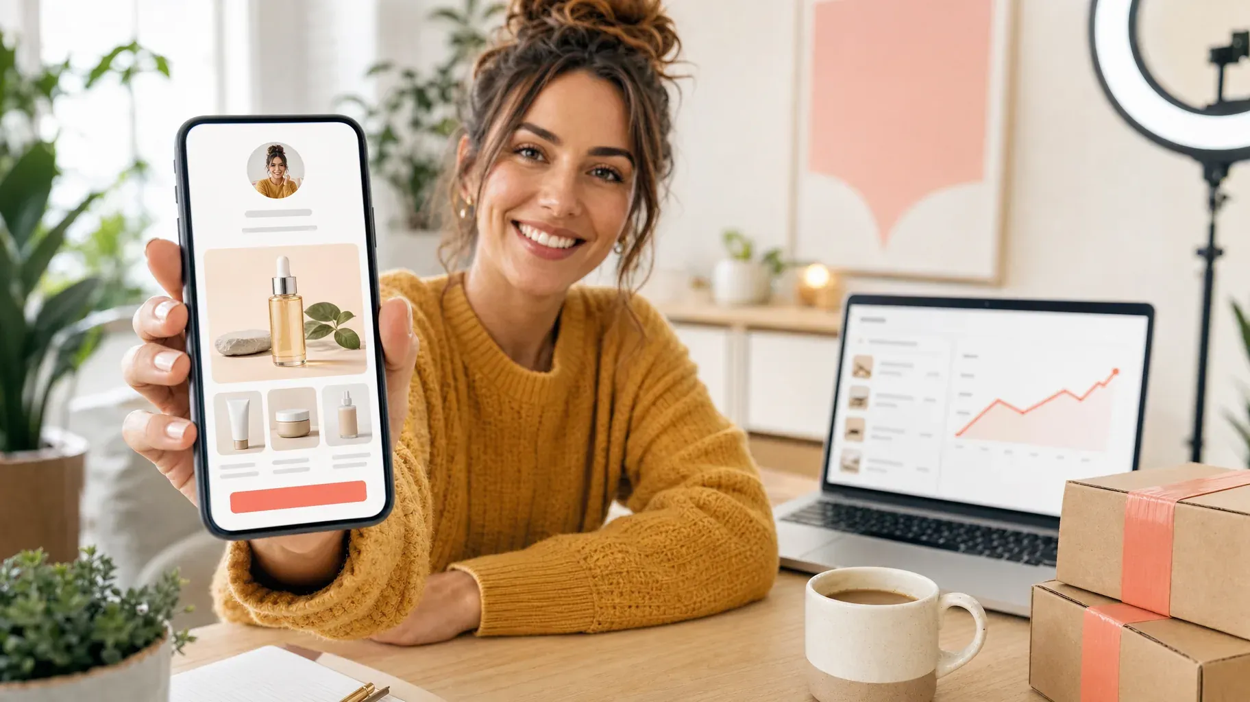
A social post can earn attention in seconds. Turning that attention into a sale takes a clearer path. On Instagram, TikTok, YouTube, Threads, and similar platforms, your link in bio is often the bridge between a person who enjoys your content and a person ready to buy from you.
Too many creators treat that bridge like a directory: a stack of unrelated buttons, a few external links, and no obvious next move. The visitor has to decide where to go, work out what you offer, and trust another site enough to continue. On a small screen, that's more effort than it sounds, and usually more than a new visitor will give you.
This guide shows you how to build a link in bio that behaves like a compact storefront. You will learn how to make the page relevant to the content someone just watched, present offers without overwhelming people, capture interest from visitors who are not ready today, and use simple numbers to improve the journey over time.
What makes a link in bio convert?
A high-converting link in bio does not need to be crowded or clever. It needs to answer four questions quickly: Who are you? What can I get here? Why should I care now? What should I do next?
Think of the page as the next frame of your content, not as a separate website. If a creator shares a tutorial about color grading, the first thing a visitor sees should be the preset pack, a course, or a booking offer related to color grading. If a fitness coach posts a meal-prep reel, the page should make the matching plan or coaching option easy to find. Relevance reduces hesitation.
You don't need every visitor to buy. Give each one a useful, low-friction next step. That can be a purchase, a booking, an email signup, or a closer look at a featured collection. When the next step is obvious, your content has a chance to keep working after the view count stops moving.
1. Build a storefront, not a button list
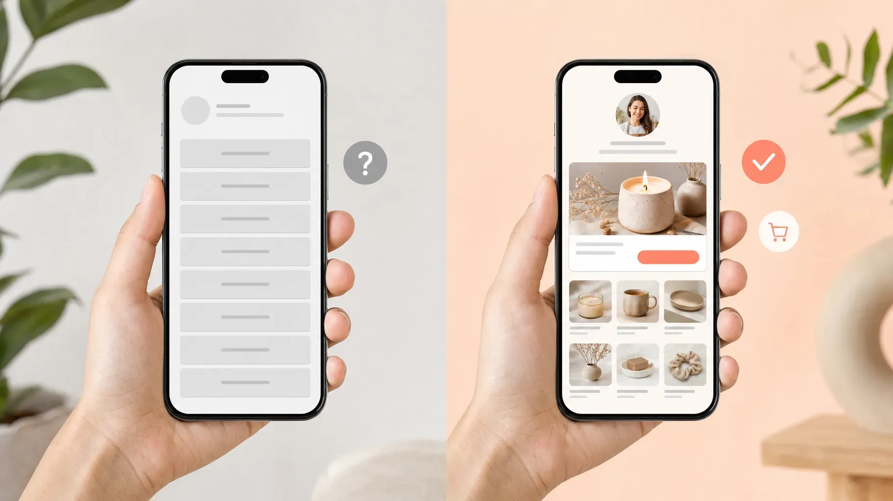
The familiar link-in-bio page is a vertical list of buttons that sends visitors away: to a marketplace, a booking form, a cloud folder, or a different social profile. Each extra destination asks someone to reorient themselves. They need to wait for another page, decide whether it looks trustworthy, and find the action again.
Instead, let people browse on the page they opened. Use a clear profile image or brand mark, a short sentence that explains what you offer, and a small, focused set of products, services, or collections. A visitor should be able to recognize the offer from your latest content, tap it, and move toward checkout without a scavenger hunt.
Start with this simple hierarchy:
- One featured offer at the top, tied to your latest campaign or post.
- Two to four evergreen offers below it, such as a best seller, a service, a digital product, or a collection.
- One trust-building action, such as testimonials, an about page, or an email signup.
This order matters. It gives people a primary route without hiding everything else. If you show 12 equal choices, your audience has to do the prioritizing. Make the choice for them: this is what is most useful right now.
Your link in bio should feel less like a menu of exits and more like the first aisle of your store.
Here is what that looks like in practice. A ceramic artist posts a short video of a new batch of mugs coming out of the kiln. Her old bio page had eight buttons: shop, workshops, Etsy, YouTube, portfolio, press, contact, and a donation link. Her new page opens with the mugs from the video, priced and ready to add to a cart. Below them sit her two best sellers, the next pottery workshop with open seats, and a short signup for people who want first pick of the next batch. Everything else moved to a small menu at the bottom. Nothing was removed, but the order now follows what visitors actually came to do.
2. Match the page to the content that sent people there
Most visits are triggered by a specific moment: a reel, story, short video, livestream, or post. Someone may have seen the jacket you styled, the template you used, the result of a client session, or a quick tip that made them want more. If your bio page looks exactly the same every day, you make that person search for the connection.
Create a featured slot and update it whenever you publish content with commercial intent. The feature can be a product card, a limited booking window, a waitlist, or a free resource that leads naturally to a paid offer. Keep the wording specific. “Get the Lightroom presets from today’s tutorial” gives people a reason to tap; “Shop now” gives them a task to interpret.
Before you publish, check this three-part match:
- The post shows or mentions the offer clearly.
- The call to action tells people to visit the link in your bio.
- The first thing on the bio page repeats the promise in the post.
That consistency is reassuring. It tells visitors that they have arrived in the right place. It also makes your marketing easier to measure because the featured offer has a clear source: the content campaign that pointed people to it.
A simple rotation keeps this manageable. Keep one evergreen best seller as the default feature, and swap it out only when a new post promotes something specific. When the campaign ends, switch back to the default. You never leave a stale promotion at the top of your page, and you never have to redesign anything. Five minutes after each publish is enough.
3. Turn your expertise, time, and files into products
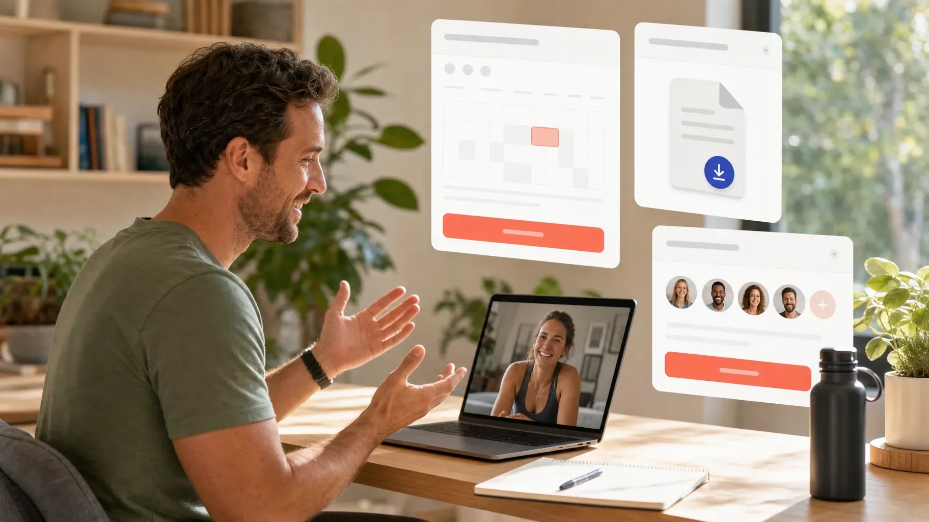
You do not need a warehouse to sell through your link in bio. Creators often have valuable offers that are harder to spot because they live in direct messages: a consultation, a brand shoot, a coaching call, a workshop, a custom commission, or access to a private community. Bringing those offers onto the page turns an informal conversation into a clear decision.
Bookings work well when people need your time. Show the service outcome, the duration, the price or starting price, and what happens after purchase. If you take deposits, say so. Clear expectations reduce back-and-forth and help the right people commit.
Digital products work well when your audience wants a fast, repeatable result. Think templates, guides, presets, meal plans, workbooks, swipe files, mini-courses, or downloadable art. Give the product a useful preview: describe the problem it solves, show what is included, and explain how it is delivered.
Memberships and paid communities work when your value is ongoing. Make the recurring benefit concrete: weekly critiques, early access to drops, a monthly resource library, office hours, or a private learning space. Avoid vague promises of “exclusive content.” People join when they can picture the experience.
For every offer, write the answer to three questions in plain language: What will I get? Who is it for? What changes after I use it? That short exercise makes product cards, captions, and landing pages sharper at the same time.
Pricing services is where many creators hesitate, so start simple. Offer one clearly defined package instead of a custom quote for everything. A 45-minute portfolio review at a fixed price is easier to buy than an open invitation to "get in touch about rates." If most clients end up needing more, add a second, larger package later. Fixed packages also make your calendar more predictable, because you know exactly how long each booking takes and what you need to deliver.
4. Make buying feel safe and simple
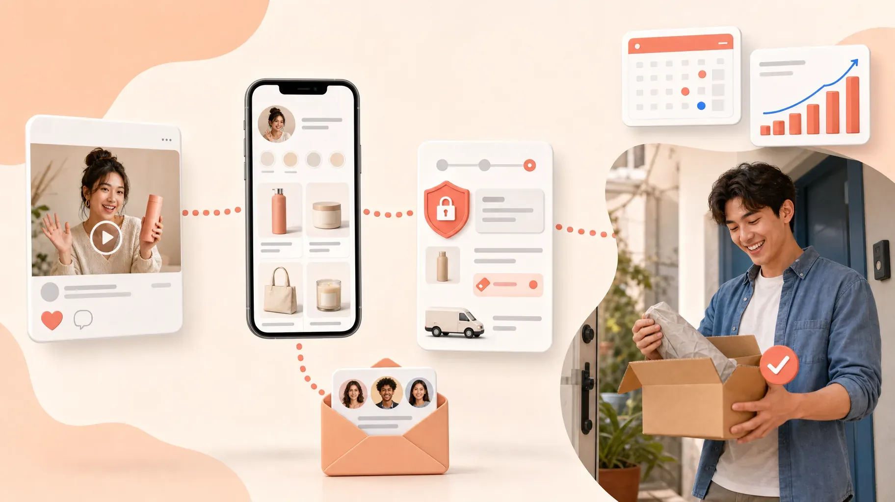
Interest can disappear at the checkout stage if the details are unclear. A customer should not have to message you to learn the price, delivery method, availability, or refund terms. The more of those basics you explain before checkout, the more confident the purchase feels.
Use accurate photos or previews, an unambiguous price, and a product description that focuses on the outcome. For physical goods, include practical information such as sizes, materials, shipping destinations, and dispatch timing. For services, describe the process and what the buyer needs to prepare. For digital products, explain access and delivery.
Trust is also visual. Use a page style that matches your content: the same profile image, colors, and tone make the handoff from social platform to storefront feel intentional. Keep the layout clean, test it on your own phone, and remove anything that slows the main action down.
Before you share a new offer, run through a quick mobile check:
- The price is visible without scrolling or tapping into a separate page.
- Product images load quickly and show the item clearly on a small screen.
- The buy or book button is large enough to tap with a thumb.
- Delivery times, shipping regions, or access instructions are written out.
- Your refund or cancellation policy is one tap away.
- The checkout works on both mobile data and Wi-Fi.
Ask a friend to buy something small from your page while you watch. Where they pause or ask a question is exactly where your next customer will hesitate too.
Roctify has 0% transaction fees on every plan, including the free plan. Your payment provider’s fees still apply, so review the details for the payment methods you use on the pricing page. Whatever platform you choose, make sure the total cost and the customer experience are easy to understand before you promote an offer.
5. Use one catalog across every sales touchpoint
Your link in bio is only one part of your business. You may also have an online shop, an email list, product tags, a messaging catalog, or a landing page for a campaign. Copying the same product information into each channel creates a quiet operational problem: prices drift, inventory gets missed, and an old image keeps appearing long after you replaced it.
A shared catalog gives you one source of truth. Add the product once, then use it in the link-in-bio shop, storefront, and campaigns. When you update a price, image, description, or stock level, the change follows the product instead of relying on memory.
This is especially useful for creators who work with a small team or on their own. A simpler system gives you more time to make content and serve customers. It also makes your page more reliable: visitors are less likely to find an unavailable item or a stale link after seeing something they want.
6. Give non-buyers a reason to stay in touch
Not every interested visitor is ready to buy today. Some are comparing options, waiting for payday, saving a post for later, or simply discovering you for the first time. If the only option on your bio page is “buy now,” those people leave with no reason to return.
Offer a useful exchange for an email address or phone number. The key word is useful. A generic “Join my newsletter” is easy to ignore; a relevant benefit gives people a reason to opt in. Depending on your audience, try early access to the next drop, a first-order code, a free chapter, a checklist, a mini template, or a waitlist for the next workshop.
Then follow through with a short, relevant message sequence. Welcome new subscribers, deliver the promised resource, and point them to the related offer. When a product launches or a workshop is nearly full, send a clear update. A few well-timed emails are enough. The people who signed up already raised their hand, so they want to hear from you.
Keep consent and privacy in mind. Tell people what they are signing up for, use a reliable system for managing preferences, and do not add people to a list without permission. A list built on clear expectations may grow slower, but the people on it actually want to be there.
7. Measure the journey once a week
You do not need a dashboard full of vanity metrics. A weekly review of a few numbers is enough to tell you where the customer journey is getting stuck. Track these stages:
- Bio-link visits: how many people tapped through from your social content.
- Offer views: how many visitors opened a product, service, or booking detail.
- Checkout starts: how many visitors showed serious purchase intent.
- Completed orders or bookings: how many customers finished the action.
- Email signups: how many non-buyers chose to stay connected.
Read the stages as a story. If few people tap your link, strengthen the call to action in the content and make the value of visiting clearer. If people arrive but do not open an offer, feature the item that matches the post and simplify the page. If visitors view an offer but do not start checkout, revisit the price, preview, delivery details, or perceived value. If checkout starts are high but completed orders are low, test the payment experience and look for unexpected costs or confusing steps.
Change one important thing at a time. For example, feature the matching product for a week, then compare offer views and orders with the previous week. Small, deliberate experiments are easier to learn from than redesigning the entire page after every post.
A real example makes this concrete. Say 400 people visited your bio page last week, 120 opened your featured course, 30 started checkout, and 6 bought. The drop from 30 checkout starts to 6 orders is the one that stands out. That points to the payment step, a surprise cost, or missing information about access. Fixing the product photos would not help much here. Clarifying what happens after purchase and testing the checkout on your own phone probably would. Next week, compare the same numbers and see whether the gap closed.
Common mistakes that cost you sales
Even well-designed pages lose customers to a few recurring problems. Check your own page against this list.
Too many equal choices. Twelve buttons of the same size tell visitors that everything matters equally, which means nothing stands out. Pick a clear first option and let the rest support it.
Vague button labels. "Click here," "Shop," and "Link" force visitors to guess. Name the outcome instead, such as "Get the spring preset pack" or "Book a 30-minute call."
Outdated promotions. A sold-out product or a workshop that already happened makes the whole page feel abandoned. Review your featured slot every time you publish, and remove anything that has expired.
Hidden prices. When people cannot see what something costs, many of them assume it is too expensive and leave. Show the price, or at least a starting price, on the product card.
Slow, heavy pages. Large uncompressed images and embedded widgets can make a page crawl on mobile data. Visitors coming from a social app expect the next screen to appear almost instantly.
No plan for non-buyers. If the only action on your page is a purchase, everyone who is curious but not ready simply disappears. A signup option gives them somewhere to go.
Never checking the numbers. Without a weekly look at visits, views, and orders, you are redesigning based on guesses. A few minutes of review tells you which of the fixes above matters most for your page.
A simple seven-day action plan
You can improve a link in bio without rebuilding your business overnight. Use this sequence to get started:
- Day one: choose the single offer you want new visitors to see first.
- Day two: rewrite its title and description around the result the customer wants.
- Day three: add clear images, price, delivery details, and a direct purchase or booking action.
- Day four: create a relevant email incentive for visitors who are not ready to buy.
- Day five: update your bio page so the offer is featured above everything else.
- Day six: publish a post that demonstrates the offer and points to the link in your bio.
- Day seven: review the visits, offer views, orders, and signups; then decide on one improvement for next week.
Frequently asked questions
How many links should a link in bio have?
There is no magic number, but fewer is usually better. One featured offer plus two to four supporting options covers most creators. If you need more, group them into collections or a secondary menu so the first screen stays focused.
Should I link to my website or sell directly on the bio page?
If your website already converts well on mobile, linking to a specific product page can work. For most creators, selling directly on the bio page removes a step and keeps the experience consistent with the post that sent people there. You can still link to your website for detailed information.
How often should I update my link in bio?
Update the featured slot whenever you publish content that promotes something specific. Review the rest of the page once a month to remove expired offers, refresh images, and check that every link still works.
Can I sell digital products and services from the same page?
Yes. Many creators combine a digital product, a bookable service, and a membership on one page. Keep each offer clearly labeled so visitors understand what they are buying and how it will be delivered.
What should I track first?
Start with bio-link visits, offer views, and completed orders. Those three numbers show whether the problem is getting people to the page, interesting them once they arrive, or closing the sale. Add checkout starts and email signups once you have a baseline.
Turn attention into a repeatable customer journey
Followers are not customers by default, and that is fine. Your job is to make the next step useful enough that the right people want to take it. A focused link-in-bio storefront helps you do that: it connects each post to a relevant offer, gives visitors a straightforward way to buy or book, and keeps the conversation open with the people who need more time.
Start with the essentials: feature the offer connected to your latest post, make the purchase path clear on mobile, and capture interested visitors who are not ready yet. Once that foundation is in place, the views your content earns can start turning into customers. Create your page and connect it to your bio today.